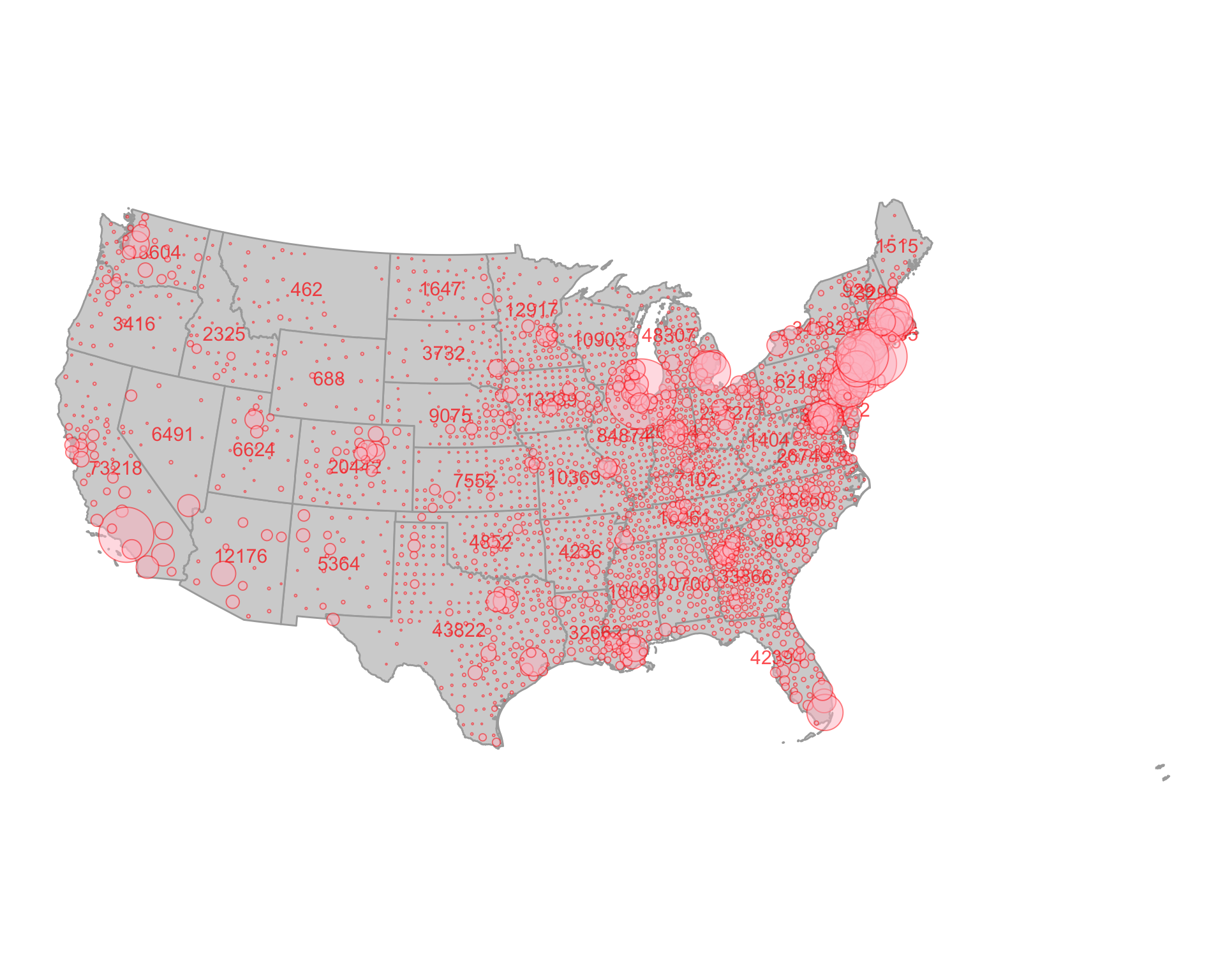
The NY Times has been making an amazing infographic of Covid-19 cases. With the data from this package, we should be able to more or less recreate it. Let’s do it for the lower 48 (moving Hawaii and Alaska is a pain!)
We’ll start by loading the coronavirus data at the county and state level
require(covid19nytimes)
require(dplyr)

covid19nytimes_states <- refresh_covid19nytimes_states() %>%
    filter(date == max(date))

covid19nytimes_counties <- refresh_covid19nytimes_counties()%>%
    filter(date == max(date))
Next, we need some county maps and state maps. For this, we’ll use the excellent tigris package. We want the centroid of counties for bubble placement.
require(sf)
require(tigris)

county_map <- counties(cb = TRUE, resolution = '20m', class = "sf") %>%
  st_centroid()

state_map <- states(cb = TRUE, resolution = '5m', class = "sf")

#make a state lookup table
state_lookup <- state_map %>%
  as_tibble() %>%
  select(STATEFP, NAME) %>%
  rename(STATE_NAME = NAME)
OK, let’s filter to the lower 48 for all data sets
filter_out <- c("Alaska", "Hawaii", "Guam",
                "Puerto Rico", "American Samoa",
                "Commonwealth of the Northern Mariana Islands",
                "Virgin Islands")

covid19nytimes_states <- covid19nytimes_states %>%
  filter(!(location %in% filter_out)) %>%
  filter(location != "Unknown")

covid19nytimes_counties <- covid19nytimes_counties %>%
  filter(purrr::map_dbl(location, ~stringr::str_detect(., filter_out) %>% sum)==0) %>%
  filter(location != "Unknown")

county_map <- county_map %>%
  left_join(state_lookup) %>%
    filter(!(STATE_NAME %in% filter_out))
#> Joining, by = "STATEFP"

state_map <- state_map %>%
    filter(!(NAME %in% filter_out))
For text labels, we use centroids of states joined with maximum number of case numbers.
state_num_centroids <- covid19nytimes_states %>%
  filter(date == max(date)) %>%
  filter(data_type == "cases_total") %>%
  left_join(state_map,
            by = c("location_code" = "STATEFP")) %>%
  st_as_sf(crs = st_crs(state_map)) %>%
  st_centroid()
Now, we join the county data and the county centroid map and filter to the last date in the data set.
joined_covid_counties <- covid19nytimes_counties %>%
  filter(data_type == "cases_total") %>%
  left_join(county_map,
            by = c("location_code" = "GEOID")) %>%
  st_as_sf(crs = st_crs(county_map))
Last, let’s make the plot!
require(ggplot2)
#> Loading required package: ggplot2

ggplot() +
  geom_sf(data = state_map, fill = "lightgrey", color = "darkgrey") +
  geom_sf_text(data = state_num_centroids, aes(label = value), color = "red",
                size = 4, alpha = 0.7) +
  geom_sf(data = joined_covid_counties,
          mapping = aes(size = value),
          shape = 21, alpha = 0.5, color = "red", fill = "pink") +
  theme_void() +
  scale_size_continuous(guide= "none",
                        range = c(0.05, 35)) +
  coord_sf(crs = st_crs(2163)) #for that nice equal area curved look