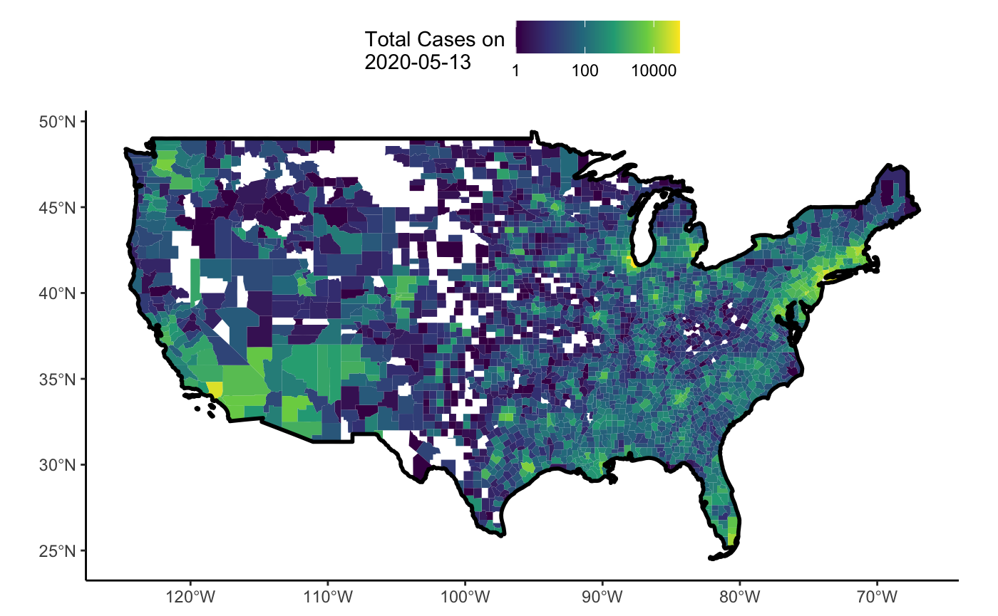
One of the wonderful features of the NY Times dataset is that it includes data by county. This can lead to some wonderful visualizations at small and large scales. Let’s take a look at the distribtion of cases across the US as a choropleth.
library(covid19nytimes)
library(dplyr)
library(tmap)

covid19nytimes_counties <- refresh_covid19nytimes_counties()%>%
    filter(date == max(date),
           data_type == "cases_total")

this_date <- covid19nytimes_counties$date[1]
So, this will be an analysis for 2020-05-13. Let’s pull in a baselayer of a county map from the tigris package.
library(sf)
library(tigris)

county_map <- counties(cb = TRUE, resolution = '20m', class = "sf") %>%
  mutate(location_code = paste0(STATEFP, COUNTYFP))
OK, let’s bring the data together with a join, using FIPS codes.
covid19nytimes_counties_sf <- left_join(county_map, covid19nytimes_counties)
Note, not all counties have data for them. So, in our case, there are 330 counties with no data.
Now, let’s plot it!
tmap_mode("view")

tm_shape(shp = county_map) +
  tm_borders(col = "lightgrey", alpha = 0.5) +
tm_shape(shp = covid19nytimes_counties_sf) +
  tm_polygons(col = "value", border.col = NA,
              title = paste0("Total Cases as of ", this_date),
              palette = "viridis",
              style = "log10_pretty")
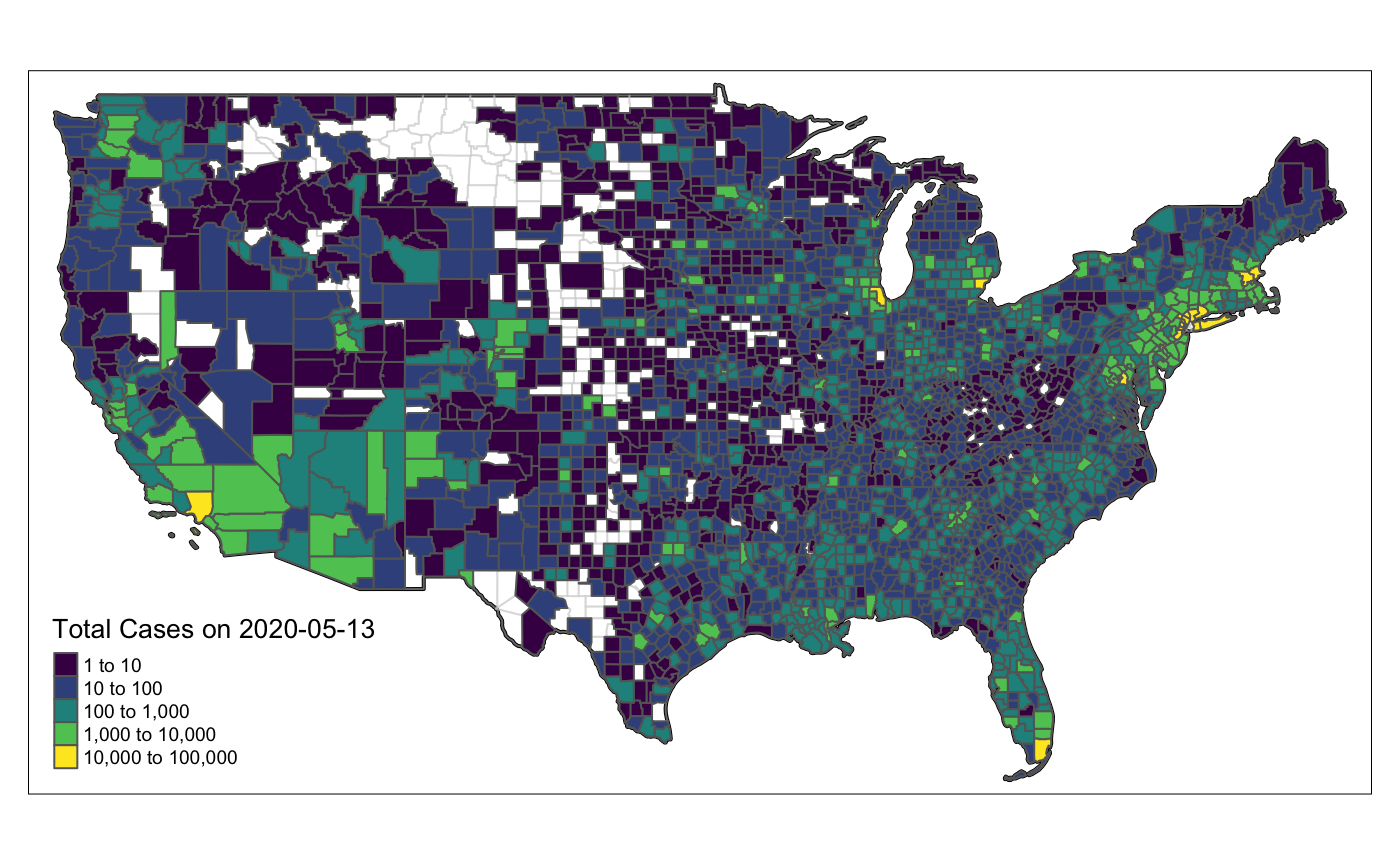
Fun - now, if we just wanted the lower 48, and static…
tmap_mode("plot")

filter_out <- c("Alaska", "Hawaii", "Guam",
                "Puerto Rico", "American Samoa",
                "Commonwealth of the Northern Mariana Islands",
                "Virgin Islands")

lower_48 <- covid19nytimes_counties_sf %>%
  mutate(state = strsplit(location, ","),
         state = purrr::map_chr(state, ~.x[2])) %>%
  filter(!(state %in% filter_out),
         !is.na(state),
         location != "Unknown")

lower_48_bg <- county_map %>%
  filter(STATEFP %in% unique(lower_48$STATEFP))

## The map
#country boundary
tm_shape(shp = lower_48_bg %>% summarize()) +
  tm_borders(col = "black", lwd=2) +

 #county boundaries
 tm_shape(shp = lower_48_bg) +
  tm_borders(col = "lightgrey", alpha = 0.5) +

 #data
 tm_shape(shp = lower_48) +
  tm_polygons(col = "value", border.col = NA,
              title = paste0("Total Cases on ", this_date),
              palette = "viridis",
              style = "log10_pretty")  +
  tm_layout(legend.title.size=1,
  legend.text.size = 0.6,
  legend.position = c("left","bottom"),
  legend.bg.color = "white")
For those of you that wish to see this example in Ggplot2
library(ggplot2)
library(plotly)

ggplot() +
  geom_sf(data = lower_48, aes(fill = value), color = NA) +
  geom_sf(data = lower_48_bg %>% summarize, col = "black", lwd = 1, fill = NA) +
  scale_fill_viridis_c(guide = guide_colorbar(paste0("Total Cases on\n", this_date)),
                                            trans = "log10") +
  theme_classic() +
  theme(legend.position = "top")