What are mobility trends like in the US?
Source:vignettes/plot_us_mobility.Rmd
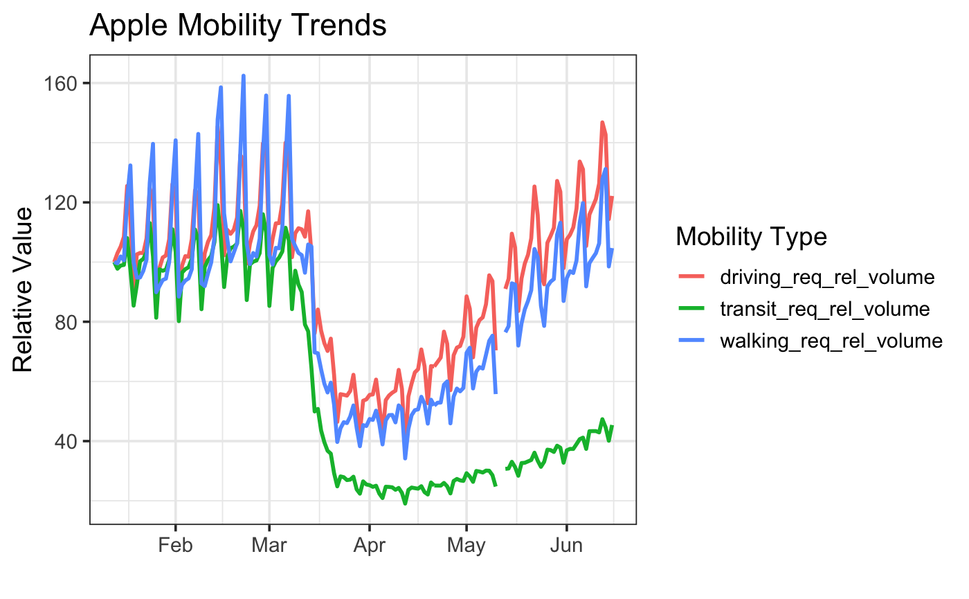
plot_us_mobility.RmdLet’s load the data, and filter down to the United States of America.
library(covid19mobility)
library(dplyr)

us_mobile <- refresh_covid19mobility_apple_country() %>%
  filter(location_code == "US")
Now, let’s plot it!
library(ggplot2)


ggplot(us_mobile,
       aes(x = date, y = value, color = data_type)) +
  geom_line(size = 1) +
  theme_bw(base_size=14) +
  labs(color = "Mobility Type",
       y = "Relative Value",
       x = "") +
  ggtitle("Apple Mobility Trends")