Work versus Home in the Google Mobility Data
Source:vignettes/google_work_v_play.Rmd
google_work_v_play.RmdGoogle’s data set is fascinating because it supplies information about a variety of different locations. The data is presented as percent change from a baseline of the average of a five week period from Jan 3 - Feb 6 2020.
The types of places are as follows (for subregions)
library(covid19mobility)
library(ggplot2)
library(dplyr)
library(tidyr)

goog <- refresh_covid19mobility_google_subregions()

goog %>%
  pull(data_type) %>%
  unique
#> [1] "retail_and_recreation_perc_ch" "grocery_and_pharmacy_perc_ch"
#> [3] "parks_perc_ch"                 "transit_stations_perc_ch"
#> [5] "workplaces_perc_ch"            "residential_perc_ch"
Cool - we’ve got workplace and residential in there. I wonder if folk were spending more time at home and less time at work? The subregions data here is states/kantons/territories, etc. Google is pretty explicit that interregional comparisons are probably not valid, but, can we look at broad trends, with each region as a data point?
First, let’s just look at, well, everything!
goog_wp <- goog %>%
  filter(data_type %in% c("workplaces_perc_ch",
                          "residential_perc_ch")) %>%
  filter(!is.na(value))

ggplot(goog_wp,
       aes(x = date, y = value,
           group = location_code)) +
  geom_line(alpha = 0.15, color = "lightgrey") +
  facet_wrap(~data_type) +
  theme_bw() +
  stat_smooth(group = 1,
              method = "gam",
              fill = NA,
              color = "black")+
  labs(caption = "Data from Google Covid-19 Mobility Report\n
       https://www.google.com/covid19/mobility/") +
  xlab("") + ylab("Relative % Change")

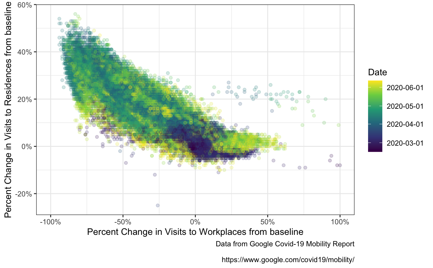
Sure looks like inverse trends! Maybe? Let’s plot the correlation!
goog_wp_wide <- pivot_wider(goog_wp,
                            names_from = data_type,
                            values_from = value)
ggplot(goog_wp_wide,
       aes(x = workplaces_perc_ch,
           y = residential_perc_ch,
           color = as.numeric(date))) +
  geom_point(alpha = 0.2) +
  scale_color_viridis_c("Date",
                        breaks = as.numeric(pretty(goog_wp_wide$date)),
                        labels = pretty(goog_wp_wide$date)) +
  scale_x_continuous("Percent Change in Visits to Workplaces from baseline",
                     labels = function(x) paste0(x, '%'),
                     limits = c(-100,100)) +
  scale_y_continuous("Percent Change in Visits to Residences from baseline",
                     labels = function(x) paste0(x, '%')) +
  theme_bw() +
  labs(caption = "Data from Google Covid-19 Mobility Report\n
       https://www.google.com/covid19/mobility/")
From this point, it’s mixed models ahoy! But I’ll leave that to you all!